
Under the trees of England I meditated on this lost and perhaps mythical labyrinth. I imagined it untouched and perfect on the secret summit of some mountain; I imagined it drowned under rice paddies or beneath the sea; I imagined it infinite, made not only of eight-sided pavilions and of twisting paths but also of rivers, provinces and kingdoms … I thought of a maze of mazes, of a sinuous, ever growing maze which would take in both past and future and would somehow involve the stars.
— The Garden Of Forking Paths, Jorge Luis Borges, 1941
What is a good metaphor for data analysis? In the spirit of Borges, Pólya, Gelman and many others since, we’re going to run with this one: navigating the forking paths of a foggy garden. It captures our belief that analysis involves deciding between (navigating) a set of discrete decisions (the forks) across different analysis options (the paths) in a continuous landscape of possibility (the garden) that becomes incrementally revealed as the analysis progresses (the fog).
Analysis is not a murder mystery or a detective challenge. Typically there is not one objective Truth to be discovered, but many potential possible discoveries. When presenting a final analysis the paths taken can be just as important as the final destination.
At best, a metaphor is a tool for thinking. We don’t believe that this metaphor captures every aspect of the problem at hand, but perhaps it illuminates components to guide the analyst through their workflow, encouraging critical thinking, suggesting where future tools may assist. We are also cautious: a danger with any metaphor is that it replaces something we don’t fully understand with something we think we do. It may lead to hubris. Nevertheless, stick with us as we dig a little deeper and consider what it might bring to our understanding of the data science process.
Interrogating the metaphor
We’ll begin by exploring five components of the metaphor (navigation, the fog, the garden, the forks, and the paths), how it ties to the practice of data analysis, where it suggests interesting angles to consider, and where it might constrain our thinking.
Fog
A fog implies we can’t see much of the garden from our current location: we have to make decisions and choose paths in order to reveal future choices. Our decisions are guided by incomplete information leading us frequently to backtrack; often a path that looked promising at first glance is later revealed to be a dead end. We might need to map our passage as we proceed to avoid getting lost. Or perhaps we rely on maps to unseen destinations left by others.
The fog is not constant; in some places it is thicker, giving us little clue about where to travel next. Experience may give our eyes more power to penetrate the fog, as past analyses help us better predict which paths are likely to lead to bountiful places.
Some destinations will be obvious from a distance; tall trees reaching above the fog. Others will be serendipitous, stumbled upon, fallen from the sky, and discovered among the bushes.
Garden
The garden implies a space that’s a mix of the human and natural, tempting us with bounty to be discovered. Depending on what you are picturing, that bounty might be a succulent tomato in a vegetable garden; an attractive fountain in a formal garden; the symmetrical layout of Italianate beds; or a prize statue at the centre of a hedge maze. Do these metaphorical objects help frame and evaluate our objectives and discoveries?
What role does the topography of the garden play? Perhaps ‘height’ is the optimality of the analysis, where the shape of the garden landscape captures the effectiveness of the underlying analysis. Is the garden flat with a multitude of minor undulations? Is it tended on a mountain, where no matter where you start, there’s an obvious destination at the summit? Or does this garden span a mountain range with multiple peaks connected by ridges and passes, separated by deep ravines.
But in a foggy landscape we may not have a clear notion of ‘optimal’. Perhaps height could mean something else. Leaning on the metaphor, gradient could represent the ease with which we can progress. Moving downhill follows established good practice, gathering momentum from the familiar. Perhaps the tools we use lead us downhill, affordances that encourage some approaches at the expense of others. Or perhaps the fog is less dense in the heights so that travelling uphill allows us to see further.
The notion of landscape emphasises continuity. Perhaps it is unhelpful to think of discrete decision-making; instead we have at our disposal choices from an infinite range of possibilities. We might continuously vary some model parameters and describe the effect on our journeys. Sensitivity analysis might describe how critically dependent our location in the garden is on how we move.
Forking
A forking path in garden of possibility implies there are choices to be made, and that those choices are discrete and finite. Let’s put aside for the moment that we could freely wander about the garden and instead we will keep off the grass.
The existence of a network of paths implies they have some topology. We suggest that understanding that topology is itself instructive. For example, those paths might form a tree: A single start point leading to multiple possible outcomes. At each stage in the decision-making process, more choices are opened up. Alternatively, that tree might be rooted in a single outcome where multiple start points lead to the same destination. Such a topology might give us confidence that our conclusions are robust; that even with changes in methodological decision-making, all paths lead to the same result. But perhaps such an arrangement should signal caution; that our methods are too restrictive, leading only to a limited set of possible outcomes regardless of the data that informs them.
The network of forking paths may form non tree-like patterns. For example, cycles that take us back to previous decision points as part of an iterative process. Or perhaps we have unconnected paths, ones that exist in the same garden of possibility but where we fail to make connections between them.
An understanding of the network of forking paths may lead to insight not just about the outcomes, but the process followed and the way it shapes the validity of findings. Perhaps these are oversimplistic or poorly fitting characterisations of different forking paths. We are intrigued by the possibility that the structure of these networks of choices are instructive in reflecting on the data science workflow by providing a rich and shareable account of the analytic process.
Paths
If a decision-point is a fork in a network of data science activity, what is the path? Does the metaphor suggest different types of path whose characterisations result in insight or meaningful consequence?
We take a path to represent some chosen activity, perhaps the cleaning of a dataset, the specification of a visualization design, or the populating of a simulation model. It is what we might traditionally document when explaining our work.
What might the ‘width’ of a path mean? Consider the popularity of a well-trodden path. Perhaps we are following a process adopted by many others, following established good (or even poor) practice. A narrow path might represent a break from convention - activity without precedence, novelty taking us somewhere few have visited before. Or perhaps we are pioneering a new shortcut to a place many others have visited. Characterising path width might help signal to us where we exercise methodological scrutiny. Examining wide paths might prompt us to question convention, or at least its fit to the problem at hand.
Our paths move us through the garden of possibility. A perilous path might be one that traverses a precipitous edge in that garden - the slightest misstep rapidly takes us somewhere quite different to our intended destination. Should we avoid peril? Or can it take us to places otherwise inaccessible?
In contrast, a wide road at the bottom of a ravine might be difficult to leave. Any deviations from convention are quickly corrected. When should we stick to these safe routes, embracing the confidence given to us by others? When should we worry that are we being unnecessarily constrained by convention and denying ourselves the opportunities of novelty and new perspectives.
Working with the metaphor
What might the metaphor mean in the data science workflow carried out by Jan – an imaginary data scientist looking to predict the outcome of a forthcoming national election?
Jan has at her disposal the results of a several national opinion polls that ask a sample of voters how they would vote in the election. She has a choice: Which of the polls does she use for her analysis? Acknowledging the existence of that choice helps to signal the possible impact of data sources on eventual conclusions.
She chooses one of the polls and signposts this was just one of several choices at this point. She wishes to visualize the distributions of the polling data. Again she has a choice - should she produce a map of the results emphasising geographical patterns, or a sequence of histograms emphasising the shapes of the distributions. Or she might choose both and compare what they tell her.
But what if she’d chosen a different opinion poll? Would that have led ultimately to different conclusions? Or what if she had chosen to represent the results in tabular format and not a map? Or what is the effect of choosing a choropleth over a cartogram?
Her path through the garden of possibilities are captured as a tree – from a single starting point (a) through the choice of polling data to use (b, c or d) and choices of output maps, charts and tables (e, f, g or h).
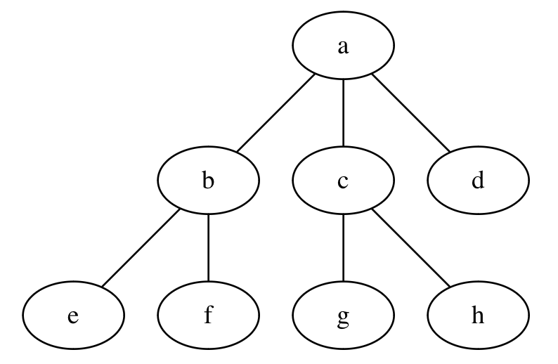
The characterisation of the topology of these choices tells us (and her) something about the process she is following. Depending on how different her interpretations e, f, g and h are, this might indicate the robustness of her conclusions.
Jan isn’t the only person working with election data. Perhaps her team started with different objectives, one emphasising the polling analysis capabilities of the team to market their services. Another focussed on assessing the accuracy of their prediction results. Another in providing commentary for a national news outlet. Perhaps their decision paths looked like this:
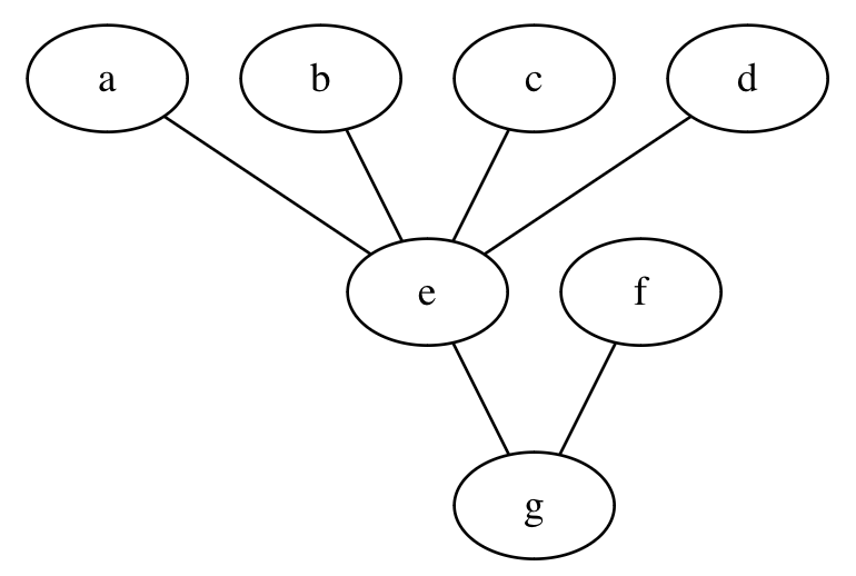
It suggests a degree of equifinality – different paths lead to the same outcome (g) even when starting from different places. Different polling data or analytical processes lead to the same predicted result. It might suggest greater confidence in the prediction. But it also signals the possiblity that results are an artefact of misapplied analytical approaches that led to the same arbitrary result.
Jan decides to build a more sophisticated MRP model to predict election results. She stratifies opinion poll results by the demographics of the respondents, runs the model to generate some output distributions and visualises the output of the model emphasising the uncertainty captured by the model. In parallel her team-mate, Arun, runs his own MRP based on a different set of data and with different parameters weighting demographics. Even though this too generates distributions of possible predictive outcomes, they are quite distinct from Jan’s MRP results.
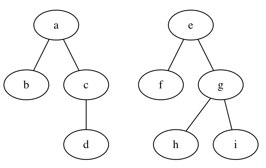
It allows the team to question why their results are so distinct. Even Arun’s exploration of model parameterisation (h and i) that had initially given him a sense of the variance in the model outputs is challenged by the contrast with Jan’s MRP outcome (d).
For a later project, under less time constraint, Jan uses intermediate results from her analysis to revisit earlier assumptions and choices in a more iterative and reflexive process. It takes place in a foggier garden where she can’t see her destination until it emerges after several iterations.
By examining this topology Jan is able to see the effect of iterating over her process, to examine how her workflow is shaping the conclusions she draws, where iteration is more or less effective.
Thinking with the metaphor
Our primary goal here is to present a metaphor that we find useful for framing data analysis. But the metaphor is only as useful as the tools and thinking it provokes, and while we don’t (yet) offer any concrete tools inspired by this metaphor, our discussion included many ideas that offer promise.
We’ve grouped our ideas into two broad categories which we explore below: navigating and documenting the journey.
Documenting the journey
As we navigate the garden, we don’t want to forget why we’re journeying and what our end goal is (and sometimes, for the flaneur, the journey itself is the goal). We need to see, collect, observe, discover, understand, and describe, documenting our journey for ourselves and others.
When should we take photos, highly realistic but low-dimensional snapshots of our observations? When should we make a sketch, a rough, quick, drawing emphasising features curated by the hand and mind of the observer. When should we a capture a specimen, a tiny snippet of reality, that we can later examine in the lab?
If our analysis takes multiple days, how do we remember what we did each day? Should we be journalling our journey each night, reflecting on the paths we have taken, missed, ignored, explored, and flagged for future exploration?
The analysis garden is large and complex, and it’s easy to lose our way and forget where we have been. As we proceed, should we be dropping breadcrumbs to remind us where we’ve been before? Breadcrumbs also allow us to backtrack, reversing from dead ends and examine the fork we have missed.
Designing with the metaphor
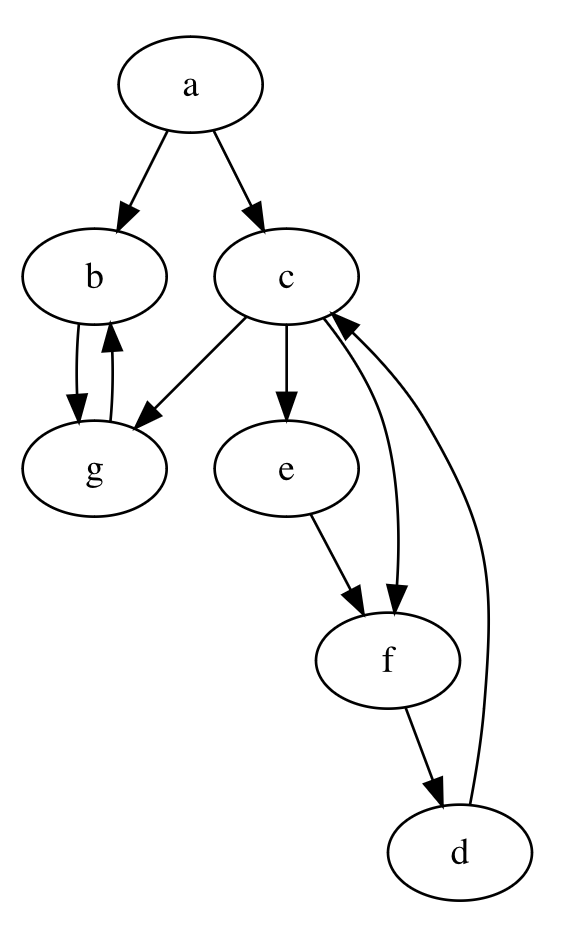
How does a metaphor help us inform workflows, attitudes, and tools for data analysis? We created the sketch below while exploring how metaphors can help (and hinder!) tool-building.
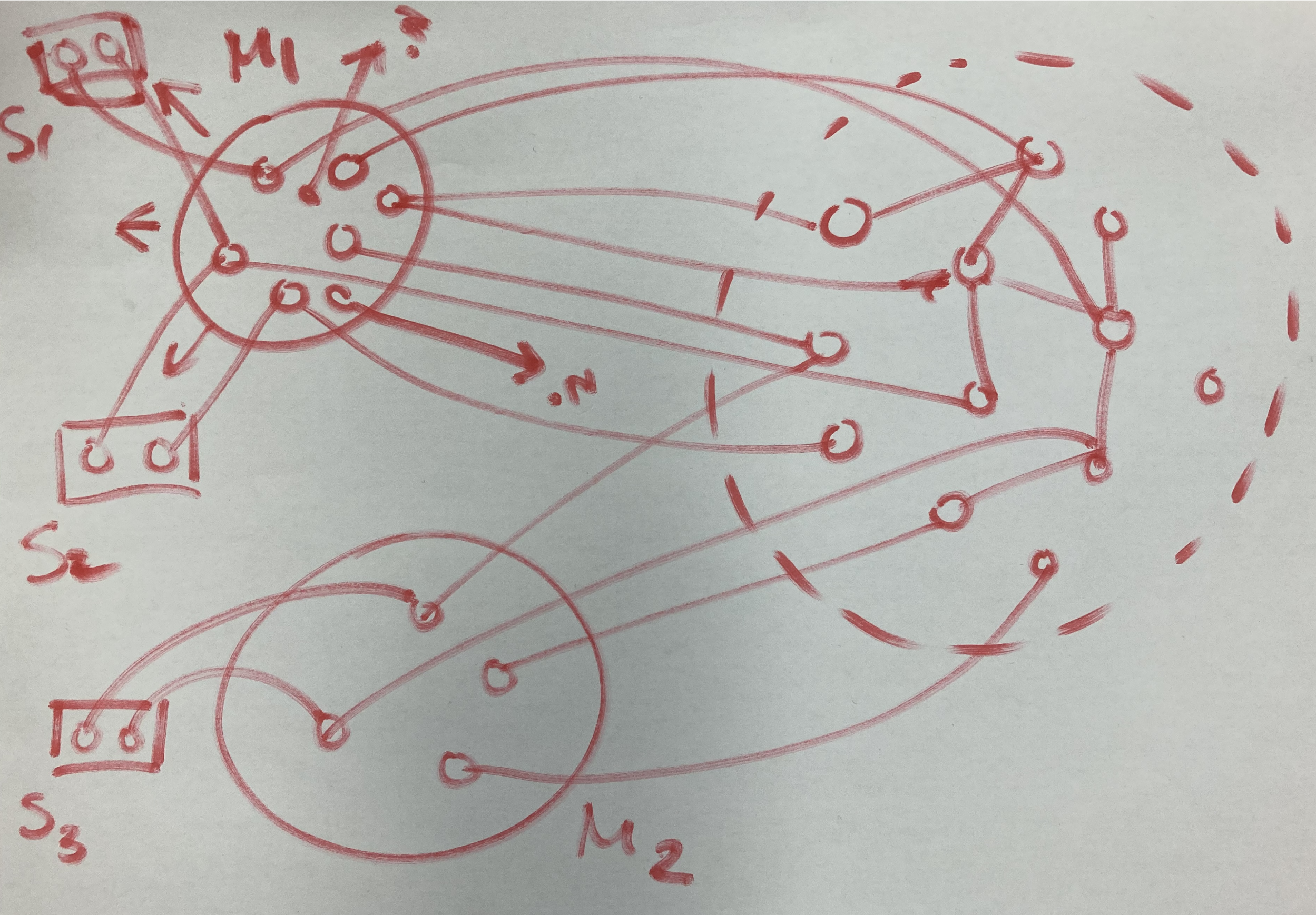
In this diagram, the metaphor (M1) surfaces items, actions, relationships, challenges and questions (circles inside M1). By extending the metaphor to its widest extent, by playing with its elements and implications, we create a rich description of the actual problem domain (data analysis, in our case). Those are the lines to the circles inside the dashed circle, the problem space. By projecting concepts from the metaphor space to concepts in the problem space, we discover those concepts in the problem space and create explicit analogies to these concepts in the problem space (links between circles in M1 and the dashed circle.)
We may not uncover all concepts in the problem space but instead of trying to understand the problem domain “out of itself” and “through itself”, our chosen metaphor helps do the work for us. We use to the metaphor to create a specific understanding of the problem space. Each element in the metaphor, fog, bridges, maps, paths etc, maps to one or more elements in the problem domain: uncertainty, data, methodology, findings, actions, etc.
A tool designer wishing to support analysts in their work can now evaluate each of those mappings:
Some mappings might be a high fidelity representation of the problem. For example, the sensation of deciding between multiple forking paths is similar to picking from a small set of possible analysis decisions.
Some mappings might be pluralistic. There might be many possible mappings and explanations for a given element of the metaphor. For example, we identified three possible interpretations of the height of the landscape above: the “optimality” of the analysis, the difficulty of analysis, or the ability to see above the fog.
Other mappings might not be useful: for example, it may be uninstructive to imagine a meaningful mapping of ‘weather’ to any concept in data analysis. Or mappings might be confusing and might lead to misunderstandings or false implications. Likewise, the notion of ‘relaxing’ or ‘recreation’ might not help at all with understanding data analysis. A designer can choose to discard those mappings.
There might be concepts in the problem space that are not explained or “discovered” by the metaphor. We accept that but it shows that the choice of metaphor is important. We based our investigation on one possible metaphor, but there are many others.
Our sketch shows another metaphor labelled M2. It prompts us to wonder how it might influence our understanding of the problem (the links and concepts discovered in the problem space) and the potential tools we could develop to assist our analysis. Does it widen or deepen our understanding, or simply reiterate what we already know?
For example, we could look at other metaphors for data analysis.
- The multiverse.
- A detective mystery.
- The needle in a haystack.
- Water and fishing (data dredging, fishing expeditions, data lakes).
- Prospecting for oil (data is the new oil) and mining.
Once a metaphor has been chosen and has been mapped to a problem space, a designer can start creating metaphor-informed solutions. In our sketch, those solutions are the rectangles S1-S3 on the very left. A design or tool does not have to cover all the concepts in the metaphor. Rather, it can focus on some specific elements and relations of that metaphor.
While metaphorical thinking can provide affordances, there may be is no benefit in making the metaphor explicit in the tools, workflows, activities or interfaces we create. Our tools don’t need to be skeuomorphic, and literally incorporate elements of the garden, fog, or forking paths into our user interfaces. We want to recreate the function of the metaphor only as far as it provides utility.
Speculating with the metaphor
We have discussed a metaphor—“navigating the foggy garden of forking paths”—that we think provides a useful framing for the process of data analysis.
What do you think? Where does this metaphor resonate with your experience and where does it feel like a poor fit? Do you ever feel lost during the process of analysis and wish you had a map, compass, binoculars, trail markers, or a GPS? Does it prompt you to consider what new tools a data analyst might benefit from?
We also believe there is general value in framing workflows, actions, and interface design around the construction of metaphors. Metaphors provide us with a means to reduce the complexity of a problem but also surface the elements we might value. We are excited by the possibility metaphor can help to understand pain points, to ease critical thinking and to shape better tools for data analysis.
Citation
@online{bach2024,
  author = {Bach, Benjamin and Wickham, Hadley and Wood, Jo and Xu, Kai},
  title = {Navigating the {Foggy} {Garden} of {Forking} {Paths}},
  date = {2024-06-25},
  url = {https://theory4ida.github.io/tmcf/posts/02-tools/},
  langid = {en}
}